As the US economy starts to recover from the Global Pandemic’s initial shock; one painful reality is also coming into focus. Racial and socioeconomic disparities correlate with the negative impact of the Coronavirus.
For instance, a recent paper from the annals of epidemiology concludes that “Nearly twenty-two percent of US counties are disproportionately black, and they accounted for 52% of COVID-19 diagnoses and 58% of COVID-19 deaths nationally. County-level comparisons can both inform COVID-19 responses and identify epidemic hot spots. Social conditions, structural racism, and other factors elevate the risk for COVID-19 diagnoses and deaths in black communities”.
As a result of these sociodemographic disparities, the one size fits all approach when dealing with the Coronavirus is not going to be very useful because of the different contexts at the local level. We argue that if we use a multi-stakeholder model to organize the information and visualize the transmission networks, we can enable a micro-targeted approach that can speed up the positive feedback loop of testing, tracing, and isolating. Stakeholder trust will increase as long as we can keep the R (Effective Reproduction Number) below one, which is the threshold needed to keep the epidemic under control.
We propose creating near real-time digital community maps supported by sociodemographic data so that organizations can make informed decisions that lead to more consistent goal achievement and more effective and fair allocation of resources. An example of such a system automatically prioritizes cases containing super-spreaders in populations with a high index of 65 and older individuals living alone and under the poverty line.
Most contact tracing solutions take information about a specific individual with COVID-19 and document all the contacts that the individual came in close contact with over the incubation period, which can be up to 14 days, according to The World Health Organization. The information gathered is then used to identify the chain of transmission and isolate the network of new cases resulting from the primary contact.
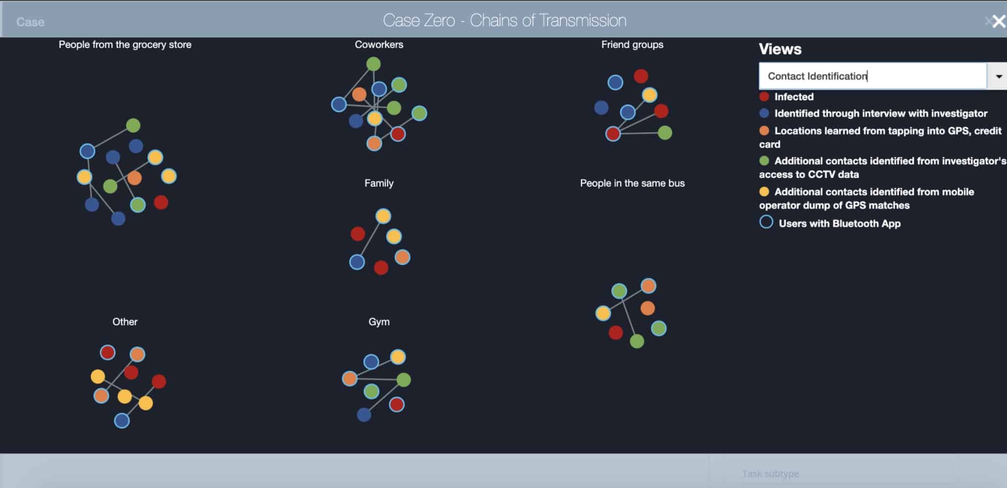
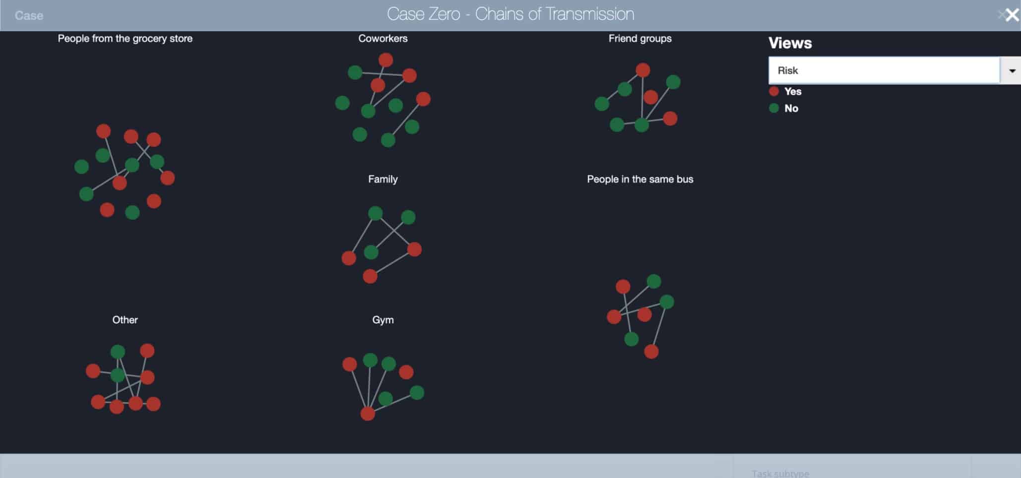
The following image illustrates an example of a Network of Stakeholders associated with a single positive case. We classified Stakeholders by group (e.g., family, coworkers, people at the Gym) and by the form of identification (e.g., using Bluetooth App, direct interview over the phone, by GPS or credit card movements).
Visualization of Chains of Transmission by Type of Identification
A multi-stakeholder approach would expand the scope of the data collected to include sociodemographic information, and to establish a system for dynamic mapping of organizations, their members, and their corresponding networks of relationships; for example, churches, synagogues, mosques, schools, community centers, museums.
By creating a digital map of the community and the visualization of the relationships, we can identify hotspots faster and get a better understanding of where the spread is happening. The goal is to isolate and prevent a single case from becoming a cluster, and from rapidly escalating to become a mega-cluster that can overwhelm the health and social services available at the local level.
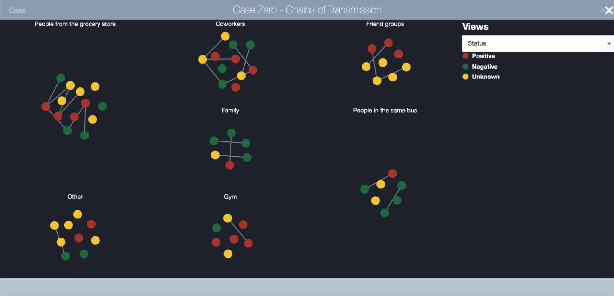
Visualization of Chains of Transmission by Status
Despite the rapid pace in which the economy seems to be reopening nationwide, still, right now, the virus is showing signs of retaking the lead, as states relax restrictions on large gatherings and welcome customers back into bars, restaurants and movie theaters. Cases are on the rise in more than 23 states across the country, with new highs in Arizona, Texas, and Florida, which tallied 3,822 on June 19th a 19% jump from what had been the record a day earlier, and it’s more than double what had been the record for single-day cases a week ago (1,902). As the level of prevalence increases, the risk of Florida becoming the next hotspot increases as well.
As we will show in the use case below, a multi-stakeholder framework can connect the archipelago of dots between stakeholders’ networks, geospatial, socioeconomic, hospitalizations, and demographic data. The result is a scalable model with a high degree of granularity that can help us understand the myriad of transmission networks.
Use Case: The San Francisco Bay Area
For this example, we will use the data set COVID-19 Vulnerability Index, a database of each county’s risk for severe illness burden due to COVID-19 trends in reported COVID-19 cases and deaths, clinical risk factors, and social and economic determinants. To develop this use case, we used StakeWare’s Stakeholder Relationship Mapping Technology.
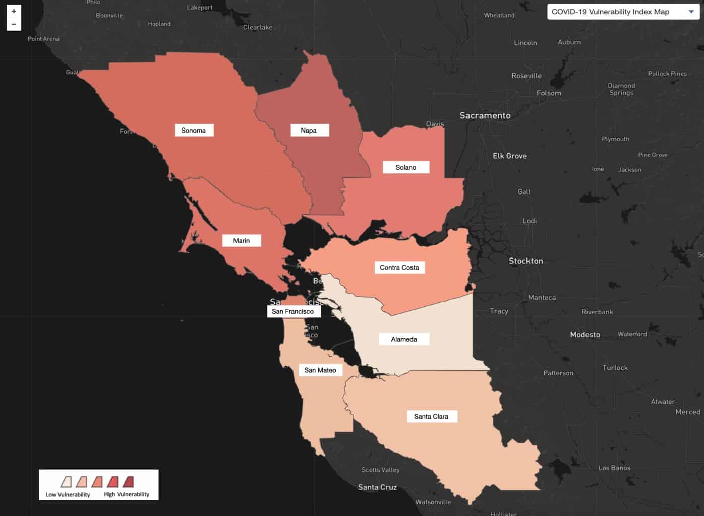
We start by looking at the nine Bay Area Counties and their ranking on the COVID-19 Vulnerability Index. We can see that Napa has the highest vulnerability because it has the darkest color, while Solano, Contra Costa, and Alameda have a lower vulnerability.
Bay Area Counties Ranked by COVID-19 Vulnerability Index
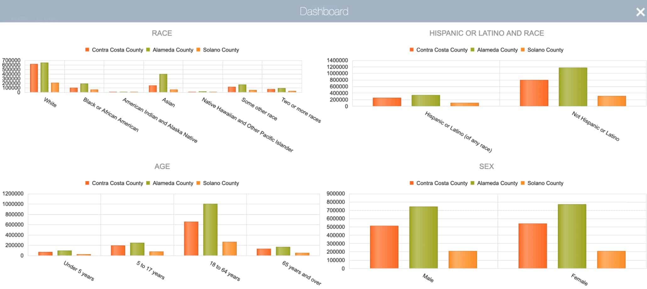
If we focus on Solano, Contra Costa, and Alameda, we can see that Alameda has the lowest vulnerability. But, if we correlate sociodemographic data, we see that Alameda has the highest number of individuals 65 years and older, and the most significant percentage of African American and Latino communities.
Socio-Demographic Data for Contra Costa, Alameda and Solano Counties (Census Data)
Data sets by race and ethnicity are crucial for understanding the extent to which there are disparities in access to and receipt of health and economic relief. For example, take the scenario of one case of a COVID-19 positive stakeholder from Alameda County that goes to Church services in Contra Costa and participates in several community events in Solano County. If we only focus on one set of data, i.e., Vulnerability Index for the county of residence, we can conclude that Alameda is a lower risk. Thus, the case should not be a top priority. Yet, if we consider the vulnerable populations within all the contact points, the impact might be much more significant.
By breaking the silos of the county data and focusing on the relationship mapping and the socioeconomic attributes of each connection, we can get a clearer picture of the optimal path to help stop the spread. This is especially so if we can provide micro-targeted mitigating measures tailored to address specific geospatial and racial disparities.
This scenario may seem far fetched, but let’s not forget the case of the Shincheonji Church in Daegu, a city of about 2.5 million in the southeast of South Korea, where a 61-year-old Shincheonji congregant — known as Patient №31 — infected many other worshipers during services. The Korea Centers for Disease Control and Prevention at some point reported that 63.5 percent of all confirmed cases in the country were “related to Shincheonji.” single case №31. The South Korean model’s success illustrates how their ability to pinpoint Patient №31 is a testament to their systems’ granularity and their capacity to act quickly and proactively.
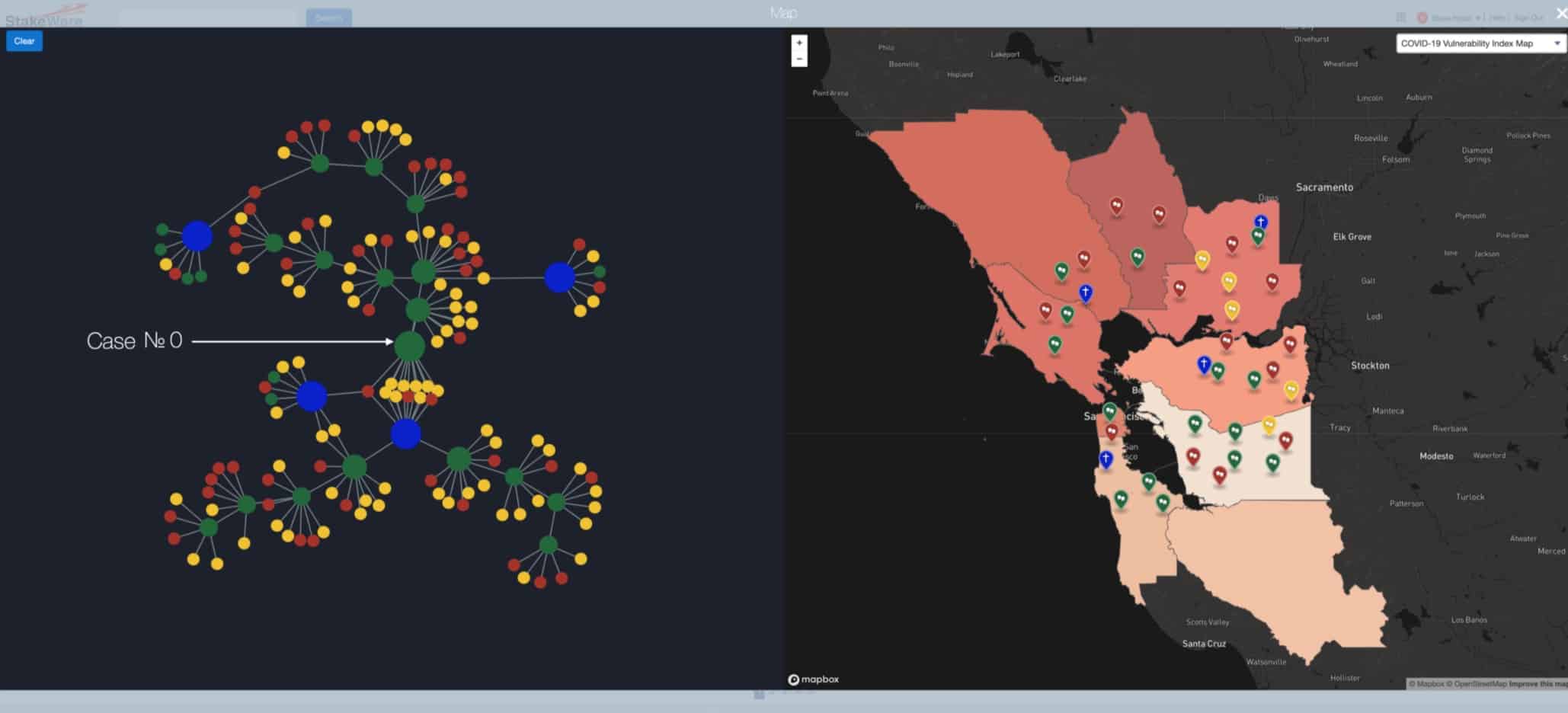
The following dashboard illustrates how the orchestration of three types of data can lead to a more proactive approach. On the left side, we have a network visualization of all the stakeholders associated with an original case (№0). The green dot pointed by the arrow represents the original case. The blue dots represent four different places of worship, and the red and yellow dots are contacts associated with the infected cases. On the right, we have a juxtaposition of the geospatial location of the stakeholders overlaid with different types of sociodemographic indicators.
When we click on the dot on the network of contacts on the left, their respective location will appear on the map on the right.
Integration of Network Analysis with Sociodemographic and Geospatial Data
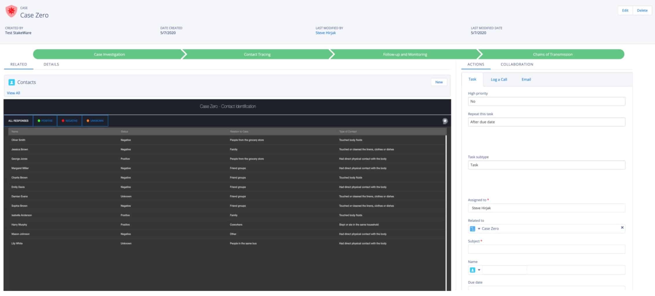
When we click on one of the green dots, we can access all the details of their case, from the case investigations to the contact traced and the chains of transmissions identified.
360 Degree View of Case № 0
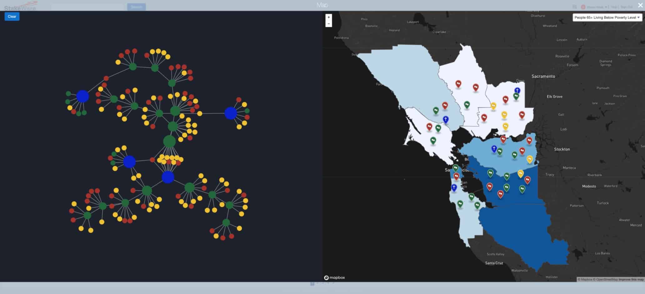
By taking sociodemographic data into account, we can create monitoring systems capable of allocating resources more effectively. The key is to be able to do this process at scale and in near real-time. For example, if we look at the problem from the perspective of counties with the highest population of people 65+ Living Below Poverty Level, then we might make different decisions regarding the kinds of thresholds that should trigger a more aggressive response.
Relationship Between a Network of Contacts, Organizations and Geographic and Economic Disparities
By having a more tailored approach, leaders can build trust with the community because they can address their most salient health and socioeconomic concerns in a proactive fashion. The following screen shows how an automated monitoring system helps the user rank contacts and take the appropriate actions during the 14 day incubation period of the COVID-19 virus. By implementing alerts and threshold notifications, the healthcare provider can log in to their system and immediately see the list of stakeholders to contact that day, prioritized by their order of importance according to the algorithm.
Automated Monitoring System
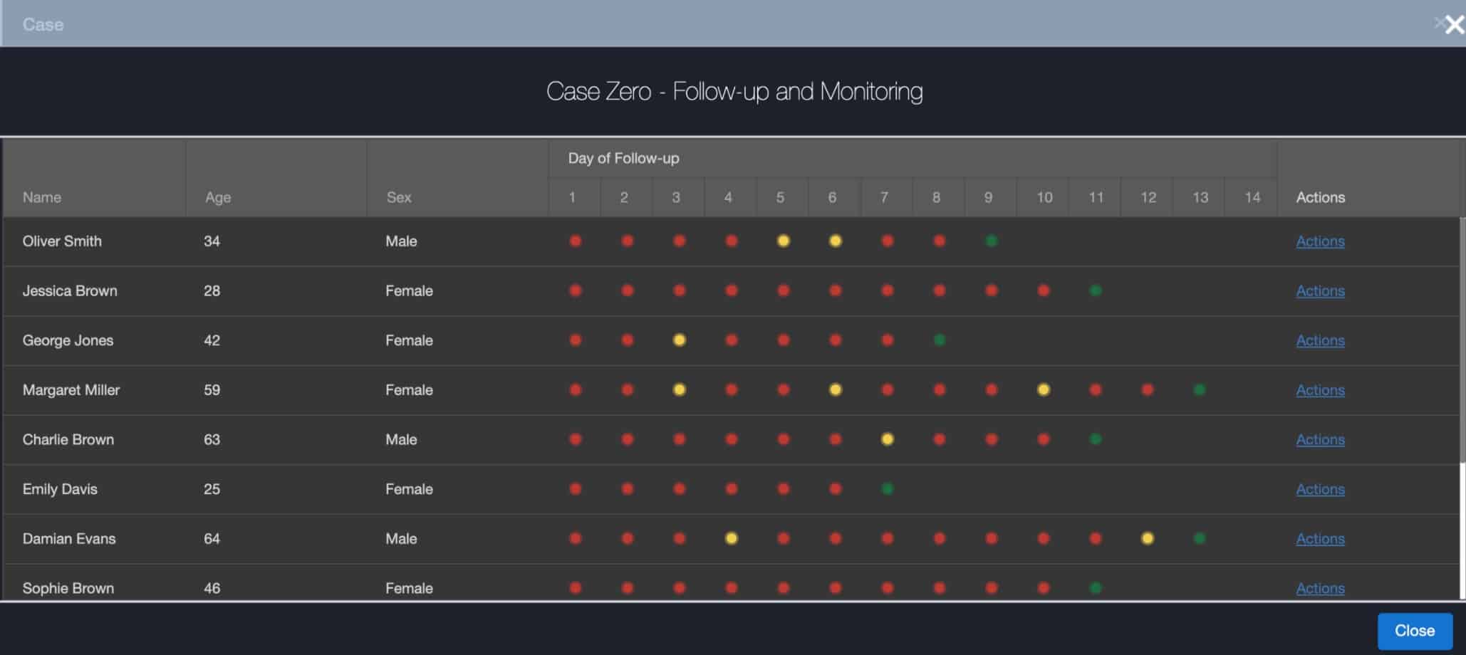
In this case, the algorithm ranks the contacts by sociodemographic, economic, and other risk factors, e.g., duration of exposure, proximity, and infectability. The goal is to find the next generation before it happens, getting ahead of that transmission cycle to stop it.
Conclusion: Using a multi-stakeholder model that considers sociodemographic data and racial disparities enables us to gain a deeper understanding of the situation at the local level. At the same time, we can take a thirty thousand foot view of the situation at a regional, state, and national level.
This dual capability enables us to address the impacts of geographic and socioeconomic disparities while strengthening vulnerabilities by balancing the receipt of health and economic relief. This holistic approach can lead to a framework for better decision-making and a more effective allocation of resources, enabling us to consider many dimensions of the relationship with a high degree of granularity and establish the appropriate level of risk and mitigating measures.
Risk Analysis for Case Zero
We propose that by creating a system built to increase trust, we can curtail the health impacts and maximize the economic benefits of reopening the economy smartly and equitably.
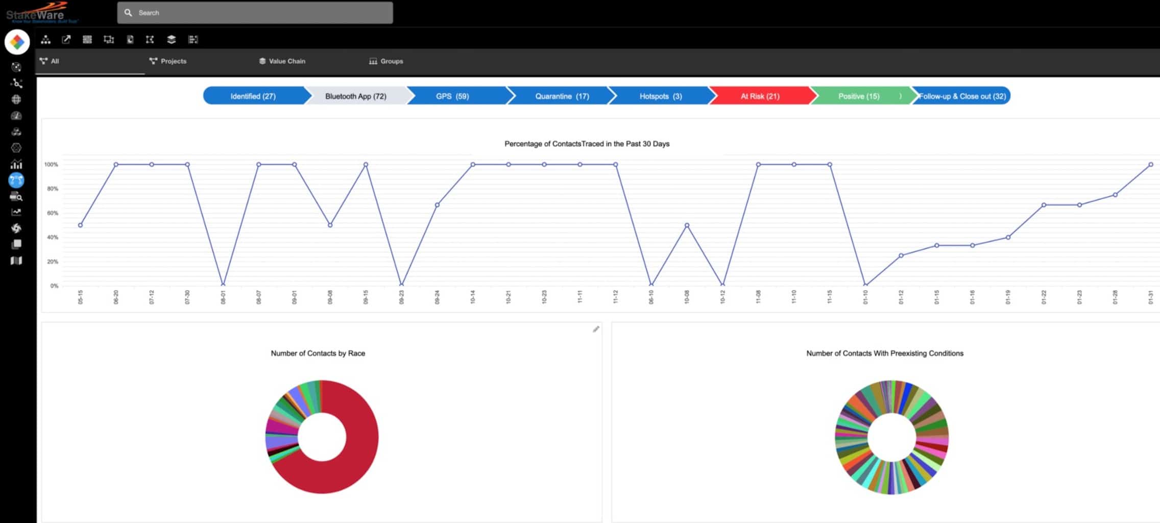
Key Performance Indicators Dashboard
In our next blog, we will explore how we can apply the same techniques to one of the other major societal issues of our times. How to bridge the trust gap in Police-Community Relations? We will demonstrate how a multi-stakeholder system designed to be an instrument of engagement and transparency can help build trust and increase stakeholder capital.
Recent Comments